Karate New Zealand
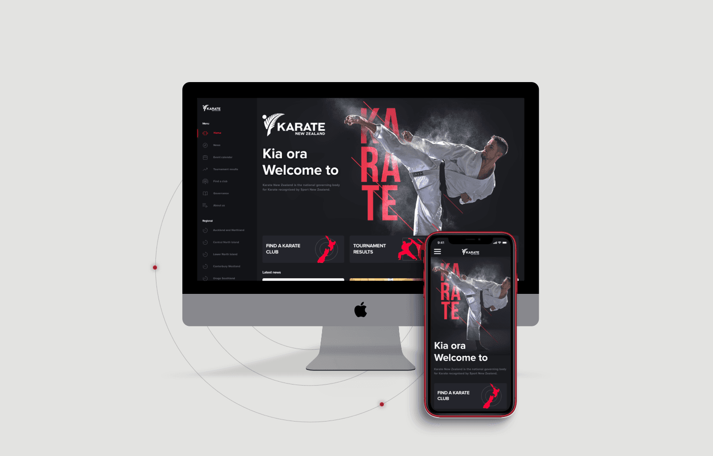
Modernising the Karate national body's digital home and brand.
Industry
B2C
Duration
3 months
Role
Lead Designer & IT Project Manager
Team
Solo design + external developer
platforms: website + mobile app
design principles guiding the system
designer led both platforms end-to-end
Overview
Karate New Zealand, the governing body for karate in the country, had an outdated platform that lacked a cohesive, modern design. The brief: redesign the official website and create a mobile app that modernised their digital presence while preserving existing content.
Understanding the brief
Karate New Zealand serves a diverse audience, athletes, coaches, event organisers, and club members. I began with in-depth stakeholder interviews to understand leadership’s vision, user pain points, and desired outcomes. Ease of navigation, accessibility, and a unified design surfaced as the essentials.
Problem statement: the existing platform struggled with an outdated, inconsistent design that hindered users from easily accessing essential information and resources.
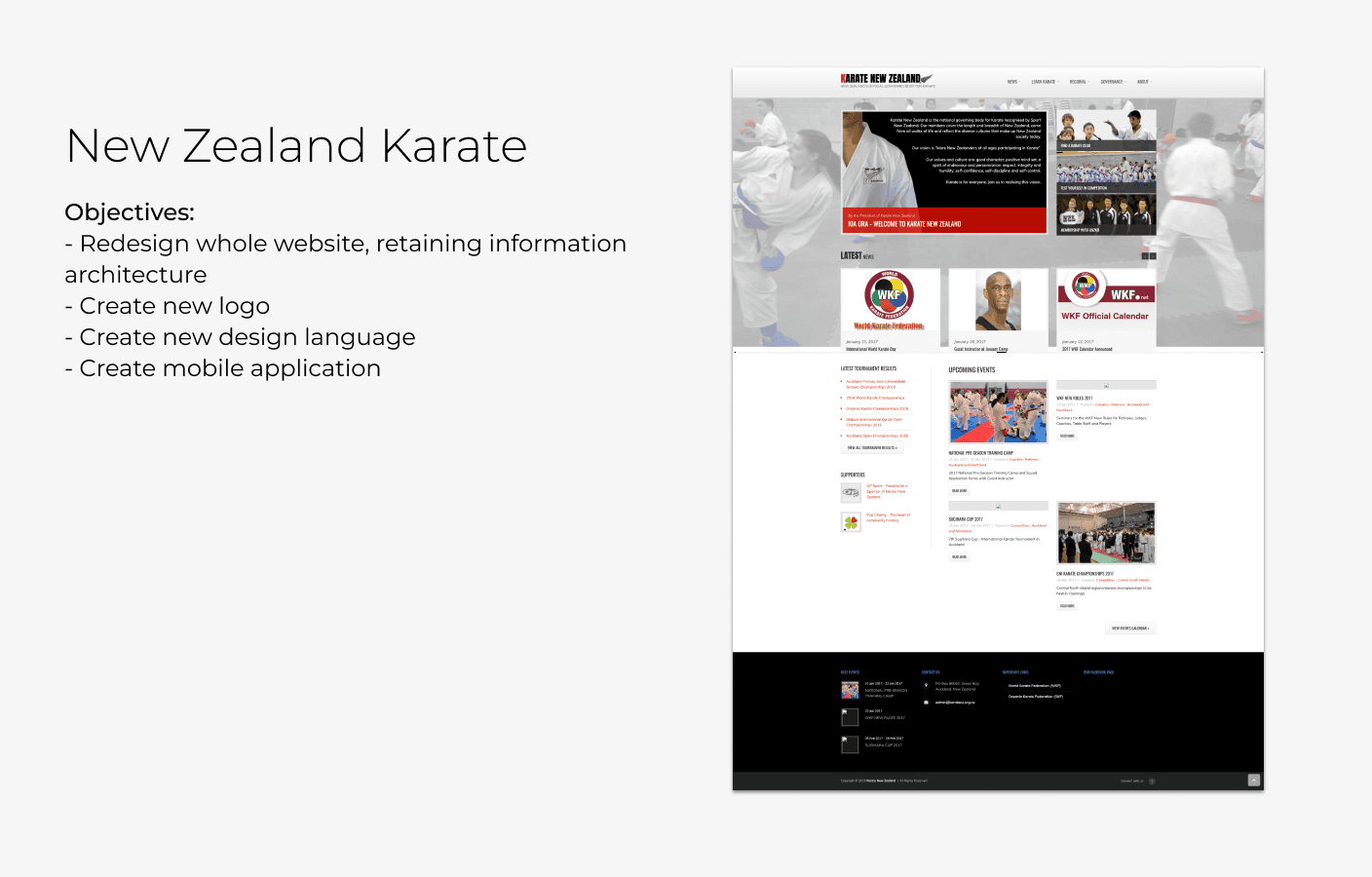
Short brief and screenshot of legacy website on WordPress
Website

Bold, sport-led with clear hierarchy and a unified brand
Mobile app

Mobile app companion
Designing with purpose
Structure & principles
I mapped an updated site architecture that preserved existing content while creating a cleaner, more engaging flow. Four principles guided the work: bold simplicity, consistency and cohesion, user-centric navigation, and responsive, accessible design.
Visual language
Drawing from contemporary sports marketing, I built a design system of color, typography, and iconography around the brand’s values - strength, discipline, and community. Deep reds and rich blacks conveyed power and focus, while a refreshed logo and custom icons reinforced recognition and aided navigation.
Prototype & test
Using an Atomic Design methodology and a mobile-first approach, I moved from the smallest elements to full templates and a shared system across web and app. Interactive prototypes drove a clear feedback loop with stakeholders, and thorough documentation ensured the build matched the design.

Inspiration and moodboard

New Logo and style
A revitalised digital platform
The result was a platform that felt modern yet familiar, letting users navigate with ease. Stakeholders approved the designs with minimal changes, noting how closely the final product matched their vision.
Reflections
The project reinforced the value of early stakeholder engagement and in-depth research. Atomic Design proved its worth for scalable, consistent components, and a mobile-first strategy was essential for usability across devices.
