Downer Intranet
A blueprint that turned a fragmented intranet into one consistent, faster-to-build system.
Industry
Enterprise
Duration
1 month
Role
Product Designer
Team
Cross-functional + department stakeholders
unified template system for all teams
research methods used to uncover real navigation needs
faster page development with reusable components
Overview
Over time the Downer intranet had grown into a fragmented platform where every department’s pages followed different structures and styles. The Downer Intranet template system was created as a blueprint for consistency, improving usability, navigation, and page-build speed across the digital workspace.
The fragmented intranet
The intranet had evolved into an inconsistent platform where each department followed different structures and styles, creating confusion, slowing productivity, and frustrating employees searching for information. The goal was a unified template guide that made the intranet easier to use, visually cohesive, and scalable across departments.
High-level goals: streamline structure, improve navigation and accessibility, and reduce development time for new pages, a blueprint for consistency and ease of use.

All SharePoint pages were inconsistent with various navigation structures and layouts
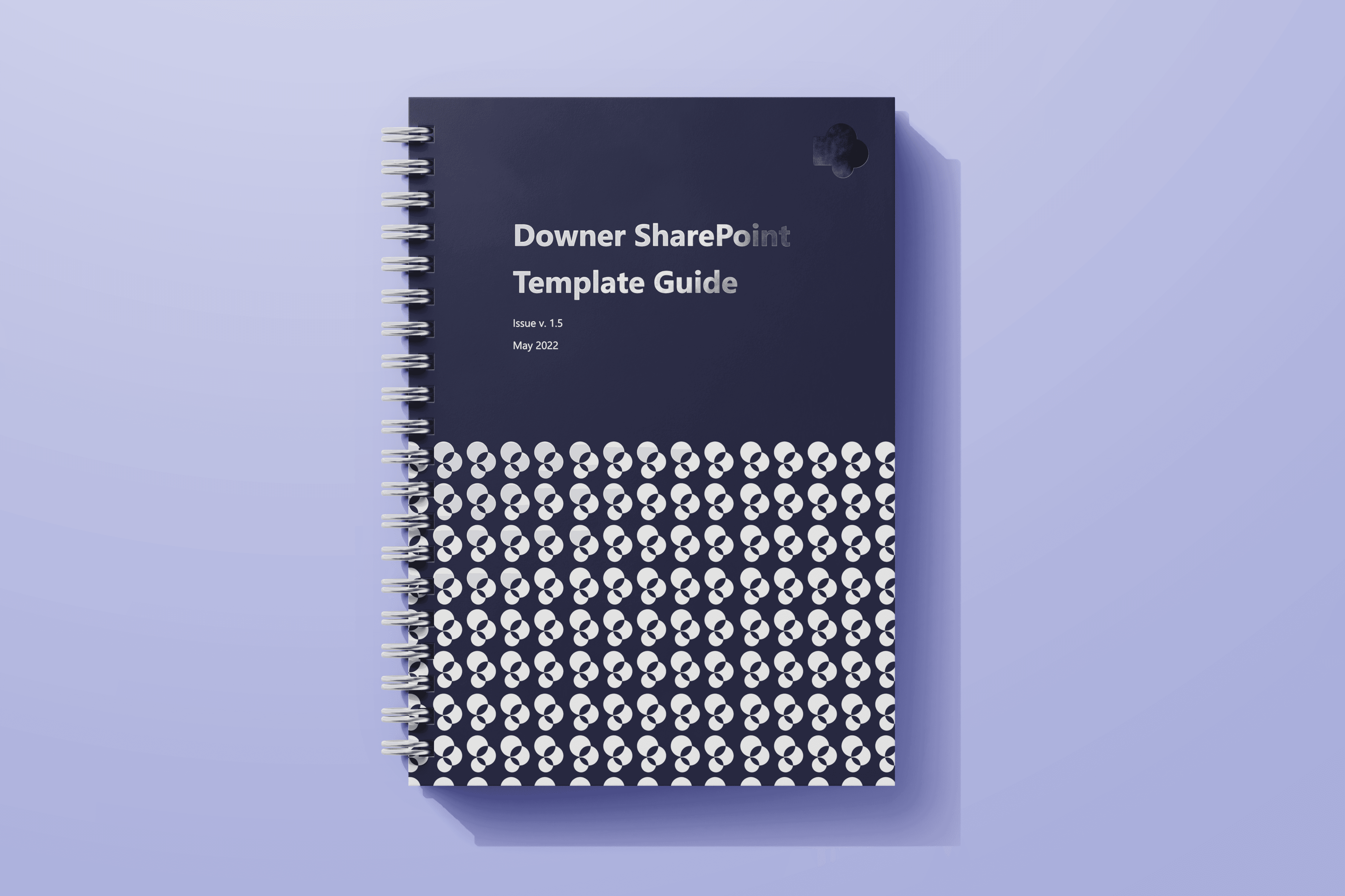
Template guide

A detailed reference for typography, icons, colors, and navigation patterns
Redesigned pages

Landing pages rebuilt directly from the template system
From insight to framework
User-centred discovery
Interviews, surveys, and focus groups with employees who relied on the intranet daily surfaced navigation challenges, desired features, and content preferences. Stakeholders and department heads were consulted to align the guide with business needs.
Structuring consistency
I created a clear information architecture and a library of components and layout standards content creators could apply, cohesive without sacrificing individuality. Navigation standards meant users never had to relearn the interface moving between departments.
Prototype & document
Interactive mockups let stakeholders experience the design firsthand, and comprehensive documentation outlined each component, layout rule, and usage guideline so any department could build independently.

Navigation test showed almost triple success rate among 100 users
Impact & reflections
The guide brought a new level of consistency: clearer navigation, faster access to information, and a stronger sense of brand identity. Departments could build new pages quickly from pre-defined templates and components, cutting development time.
Looking ahead
Engaging users early and gathering continuous feedback proved essential. With the guide in place, the company has a scalable framework — with room to expand into additional templates and resources as needs evolve.

Some other pages from guide